The 7 things I do to every photo in Lightroom
I often get asked about where to start with processing photos in Lightroom, what things do you need to tweak to get the ball rolling, as it were. So this is my "secret sauce" that I apply to EVERY photo that I import into Lightroom, and with these 7 changes it normally takes a flat RAW image into something that I can see the potential in.
And I must stress that this is only a starting point (although sometimes it is enough) for my images.
So here is a cow I met one day. This is not the most stunning photo of a cow, but it will do for this blog (her Mum would probably think it is a great shot of her... )
The image on the left is the RAW file straight out of the camera after I have imported it into Lightroom (technically it is the Jpeg that Lightroom creates from the raw data) and on the right is the image after I have applied my "secret sauce".
In my eyes the image on the left looks fine, if a little flat and dull, but the image on the right looks so much better with more contrast and colour.
So what did I do?
Step 1: The Basic sliders
So here is the basic panel in the Develop module of Lightroom with the sliders set at their default, and obviously the before image from above.
All I do is move the highlights slider to the left ("lower the highlights"), the shadows slider to the right ("open the shadows"), the whites slider to the right and the blacks slider to the left. Note that the amount I move these sliders are fairly random, but the amounts shown below work for me, and again this is just a starting point.
And below is the effects of those 4 changes.
Without going into too much technical stuff, moving the highlights and shadow sliders allow more of the captured image data to be visible at the dark and light end of the brightness scale, and the white and black sliders stretch that image data to create more contrast in the image. If you understand histograms (a topic in itself) you will see the difference that these simple changes made to the histogram as well.
The most surprising thing is that even though I have not increased / changed the colours with any of the colour sliders (white balance, saturation etc) in the image, it suddenly has more colour to it. This is caused by the increase in contrast in the image, which effects the 'punch' that the colours have in the image as well.
To make it easier to see the differences below is a before and after for step 1.
Step 2: The Lens corrections
Lightroom has the ability to correct an image for know flaws that are present in the lens that was used. This is a pretty powerful, and easy to use tool that I always make use of.
Most commonly these fixes relate to the vignetting (darking around the edge of the image) and distortion caused by a lens during capture, but it also makes an effort to correct Chromatic Aberrations in the image (these are the purple and green areas that sometimes appear on the edges of dark objects especially when they are right next to a bright area like the sky)
Below again is the image as it comes into Lightroom, this time showing the lens correction panel next to it, with the corrections unchecked.
This step is as simple as ticking the 2 boxes at the top of the panel, and if necessary selecting the correct lens in the Lens Profile part of the panel by using the drop down menus. Lightroom will try to pick the right lens for you based on the information in the photo, but sometimes it gets it wrong or just doesn't have a clue which one to pick so it picks none.
Here is the photo with the 2 boxes ticked (note that I have undone the changes in Step 1, so you are only the seeing the changes caused by this panel)
And for clarity here is a before and after of the image, again with the only difference being the changes in the Lens Correction panel.
You will see that the after photo appears to be cropped in slightly (look at the amount of the fence visible at the left edge of the frame just above the cows back), this is caused by Lightroom correcting the distortion from the lens and needing to crop in slightly to keep the image rectangular.
Also the after image is lightened around the edges (in fact across most of the image except the very centre) to correct the effects of the vignetting in the lens.
Step 3: Camera Calibration
This panel allows the colour profile of the image to be changed to match the profiles that are available in your camera, or more usefully it will allows you to use the same profile that you used on the camera (probably Camera Standard or something similar) when taking photos and reviewing them on the LCD on the back of the camera, and have the Lightroom colours match the camera ones.
It isn't essential that the Lightroom / Camera profiles match, but it does mean that the colours you see on the screen more closely match that you saw when you took the photo. In fact some people use this panel (I am looking at you Fujifilm users) to utilise the film emulations / colour profiles that are available in camera by applying them in Lightroom (eg changing the image to black and white, applying a VIvid profile to saturate the colours etc).
Normally all I do in this panel is change the colour profile from the default "Adobe Standard" profile to Camera Landscape which I have my Nikon D800 set to in camera.
Again the image as it comes into Lightroom.
And after changing the profile ( with no other changes to the image except in this panel)
Again not a big change to the look of the image, if anything the image is a bit darker, but the colours have become a bit more saturated.
And a direct comparison before and after for just this panel.
Conclusion:
So the 7 changes (4 sliders, 2 tick boxes and 1 drop down menu item) that I make to every photo in Lightroom; they are not big changes but they normally get the editing process off to a good start. I would encourage everyone to look at including these changes at the start of their Lightroom workflow.
And again for comparison a before and after shot below showing the effects of the 7 changes on the original image.
I have created the changes listed in this blog as a preset in Lightroom and these changes occur as the image is imported automatically, but performing the 7 tweaks manually only takes a few seconds.
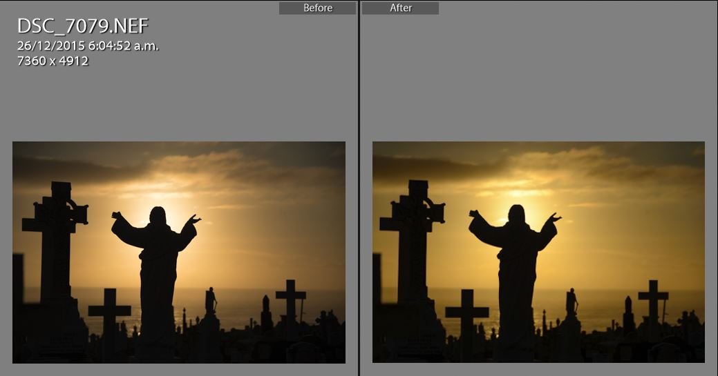
So below are some more images to show the improvements when I just do the 7 things above.
The differences are subtle but if you look between the before and after a few times you will see the differences. Again this is just a starting point.
Hopefully this little blog helps you get started in Lightroom, to pull out the potential from your RAW images.


